We rebuilt Evercontact around one idea: your inbox is already your CRM
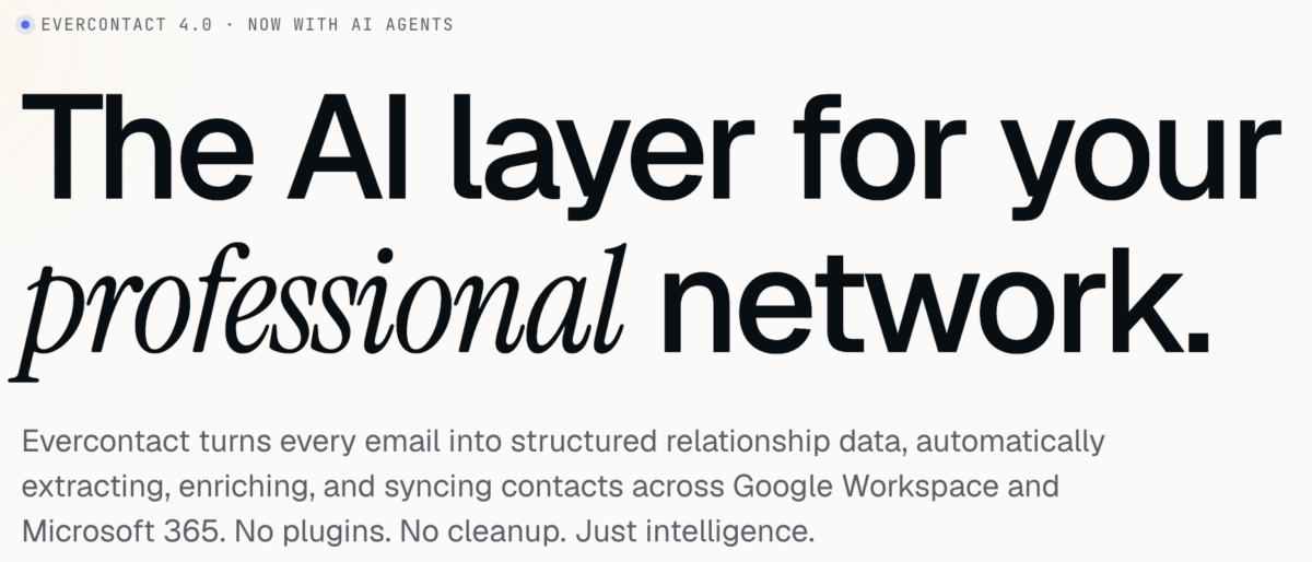
Today we’re shipping Evercontact 4.0, a full redesign of the product and the site that explains it. This is the biggest change we’ve made in a decade of operating, and it isn’t a coat of paint. We tore down the old “contact extraction tool” framing and rebuilt Evercontact as what it had quietly become: the AI layer for your professional network.
Here’s what changed, why we made the calls we made, and what’s new in the dashboard.
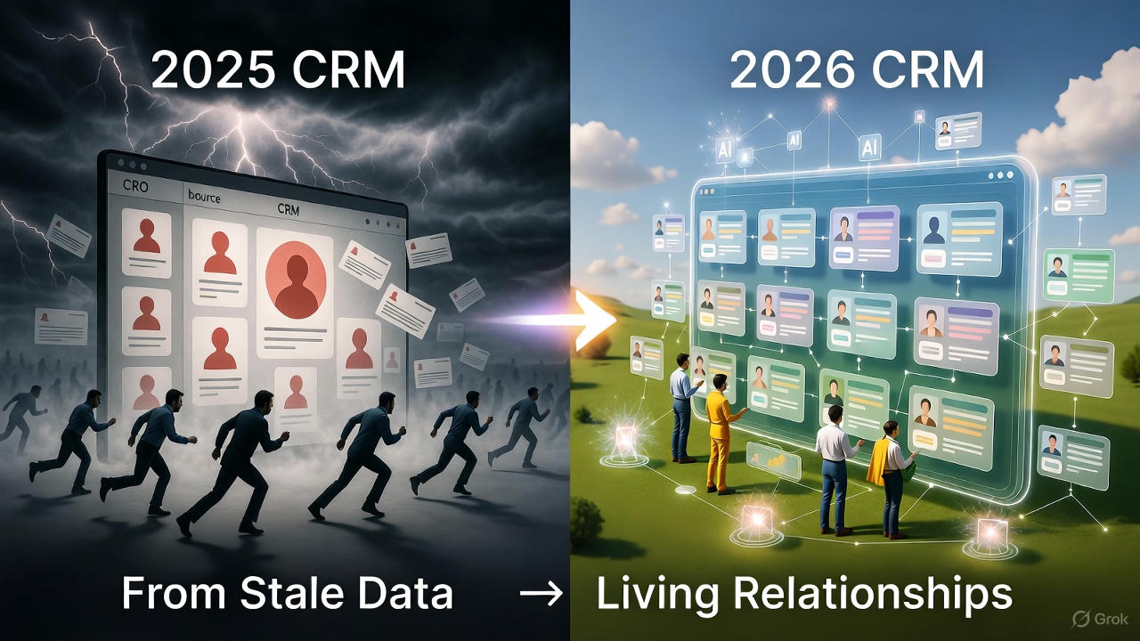
The thesis: stop treating contact data as a feature
For years, contact extraction was sold as a checkbox: a thing that scraped a signature and dropped a row into your address book. Useful, narrow, forgettable.
But every email your team sends is a structured object waiting to happen. There’s a person in it, a company, a title, a phone number, a relationship, a decision. The inbox isn’t a place where contact data lives near. The inbox is the source of truth. Every other system, your CRM, your address book, your warehouse, is a downstream copy that’s already going stale.
So we stopped designing around “extract a contact” and started designing around a single sentence: turn every email into structured relationship data, automatically. That reframing drove every decision below.
Design choice #1: show the product working, not a screenshot of it
The old homepage led with a static hero image and a list of adjectives. We replaced it with a live transformation. The first thing you see on evercontact.com now is an actual email, Amélie’s “Q3 partnership kickoff” thread, being read, parsed, enriched, and synced to HubSpot, Salesforce, and Google Contacts in 3.4 seconds, on screen.
We debated this for a long time, because “show the live product on the marketing page” is harder to build and easier to get wrong than a polished mockup. We shipped it anyway, for one reason: trust is the entire product. You are handing us your inbox. A buyer in that position doesn’t want to be told the magic is fast and clean. They want to watch it happen. The demo isn’t decoration. It’s the argument.
Design choice #2: expose the work
Most AI products hide the machinery and ask you to take the output on faith. We went the other way. Across the new site and dashboard, we deliberately surface the intermediate state: the parsed JSON, the individual fields lifted from a signature, the dedup graph collapsing three records into one truth, the sync destinations with their timestamps.
That’s an unusual choice for a “clean, minimal” redesign, and it was intentional. When the category is full of black-box enrichment vendors, legibility is a differentiator. Showing you the structured object we built from your thread is how we prove we actually read the inbox, instead of guessing from a third-party data pool, which is what the vendors we replace tend to do.
Design choice #3: privacy moved from the footer to the spine
In the old design, security lived where security always lives: a trust badge near the bottom and a legal page nobody reads. In 4.0, the privacy posture is a load-bearing pillar of the narrative, with its own section, its own data-flow diagram, and a place in the FAQ that doesn’t hedge.
The commitments are stated plainly because they’re absolute: we never train on your data, we never store message bodies, and we never sell, pool, or syndicate your contacts, ever, to anyone, for any price. No data-broker side business. No shared enrichment graph fed by your inbox. Per-tenant isolation on hardened infrastructure, SOC 2 Type II, GDPR-native consent, regional data residency.
We put this front and center because enterprise buyers told us, repeatedly, that the privacy posture was the reason they started the conversation, not a box they checked at the end of it. The design should reflect what actually matters to the person reading it.
Design choice #4: quiet on purpose
The visual language of 4.0 is restrained: lots of whitespace, low chrome, monospace accents where the product gets technical, almost no decorative noise. The headline on our customers section is the design brief for the whole thing: “Quiet infrastructure for loud revenue teams.”
Evercontact is meant to run in the background and disappear. A loud, busy, animation-heavy site would have contradicted the product. We wanted the design to feel like the thing it sells: calm, fast, and out of your way.
What’s new in the dashboard
The marketing site is the promise; evercontact.com is where it’s kept. The redesigned dashboard, “Inbox → Intelligence,” is the heart of 4.0.
The live enrichment panel. When a new person appears in a thread, you watch the record assemble in real time: name, title, company, phone, location, parsed from the signature, matched against verified sources, and written back to your CRM in under four seconds. No “import,” no “sync now” button. It just happens as the mail arrives.
The autonomous AI agent. This is the headline of 4.0, and the reason the badge says “Now with AI Agents.” Evercontact no longer just reacts to incoming mail. It owns your CRM hygiene on its own. The agent runs in the background detecting stale records, missing fields, and duplicate companies, and fixes them while you sleep. You wake up to a clean book instead of a cleanup task.
Graph-based identity resolution. The dashboard now knows that “Bob Smith” and “Robert J. Smith” are the same person, and follows them across spelling changes, aliases, role changes, and company moves. Your relationship history attaches to the human, not to an email string that breaks the moment they switch jobs.
The command palette (⌘K). The whole dashboard is keyboard-first. Jump to any contact, company, or action instantly. It’s built for the ops people who live in their tools and don’t want to reach for a mouse.
Email intelligence as structured events. Beyond contacts, the dashboard now surfaces the relationship events buried in threads, warm intros, follow-ups, meetings, decisions, as clean, structured objects you can pipe into the rest of your stack over webhook, REST, or a warehouse mirror. Every thread becomes a queryable object.
Multilingual extraction, visible. The extraction model reads signatures across 30+ languages, including broken formatting, missing punctuation, and titles buried three replies deep, and the dashboard shows you which language and which fields it pulled. Six dedicated models, one coordinated agent, trained on the messy reality of business email.
The ContactRescue console. Point Evercontact at the last 24 months of your inbox and watch the recovery run live: scanning, extracting, deduping, enriching, synced, with running counts, coverage stats, and an ETA. It’s the most-watched screen we’ve ever built, because it’s the moment people discover thousands of warm relationships their CRM never saved.
Why ContactRescue got its own story
One feature got a disproportionate amount of design attention in this release, and it deserves an explanation: ContactRescue.
Most contact tools are forward-looking. They help with the mail you get from now on. But the most valuable relationship data your company owns is already sitting in the archive, unrecorded. Every time an employee leaves, a domain switches, or a business gets acquired, thousands of warm relationships quietly disappear.
So we designed ContactRescue around the moments when that loss actually happens, offboarding, M&A, domain migration, restructures, even a lost laptop, and we gave each one its own concrete promise: a clean handover in under four hours before a mailbox is suspended, a full relationship graph captured before an acquired company goes dark, zero CSV exports for a domain move. These aren’t abstract benefits. They’re the bad days ContactRescue is built to rescue you from.
The numbers we designed toward
We didn’t pick the metrics on the new site to look impressive. We picked them because they’re the outcomes the whole redesign is in service of:
- 87% less manual CRM data entry
- 4.2× more verified contacts captured vs. typing into the CRM
- 320 hours saved per rep, per year
- 3.4 seconds median time from email received to contact synced
- 99.99% platform uptime
If the design did its job, you felt those numbers were inevitable by the time you reached them, because the product you watched working on the way down the page already made the case.
What stayed the same
One thing we refused to change: your contacts are yours. No browser extensions to install, no middleware, no lock-in, and a one-click export to CSV or any CRM. A decade in, the promise is the same as day one. 4.0 just makes it faster, smarter, and quieter.
Connect your inbox in 60 seconds and watch the first contacts flow in. We think you’ll see the thesis immediately: your inbox was always your best CRM. Now it acts like one.
Evercontact 4.0 began rolling out to all accounts on Jun 29, 2026. The new dashboard is live for every plan; existing layouts remain available for 30 days during the transition.