![]()
Your contacts are valuable and critical to your success. But if you want to get the most out of them, here are some tips to optimize your sales landing page.
We at Evercontact will ensure you never lose a contact, but you’re likely interested in securing more contacts in the first place. And for all the hoopla and noise surrounding your business operations, your lifeblood likely boils down to one seemingly simple thing: converting those leads.
If lead conversion is your lifeblood, the landing page is your heart. It’s solely responsible for pumping new customers into your user base, generating those coveted sales figures, and keeping the proverbial engine running.
Now that’s all good and well… As long as your heart’s beating healthily. Realistically, creating an effective landing page is a delicate matter that can make or break your revenue. The tiniest of details can entice a prospective customer or put them off completely.
With the success of your company so heavily dependent on this one page, doing your due diligence to optimize its top-to-bottom effectiveness is crucial.
1. Simplicity
We’ve all heard of information overload: as much as we’d like to think we excel at multitasking, our brains get overwhelmed with too much stimuli.
So, do everyone a favor by simplifying your landing page to the max. Identify what’s most important and have that dominate users’ attention; remove superfluous visuals, narrow down your copy, and get rid of all distracting clutter.
Furthermore, simply minimizing navigation options and reducing the number of form fields requiring user info could give you a spike in conversions.
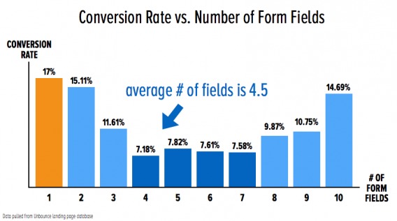
In essence, your landing page should look like it just underwent Spring Cleaning.
By limiting the distractions, you can better pave a road for your prospective user base to follow. And by doing so, you can better streamline your core message.
2. Streamlined Message
There’s probably a ton you want to tell your customers. After all, this is your product; you’ve been crating it together day and night!
The sad reality, though: They don’t want to hear it all.
On this note, the experts at Unbounce recall Swedish pop duo Roxette’s Greatest Hits album titled “Don’t Bore Us, Get to the Chorus!” Indeed, that is the goal here: a streamlined messaged that simultaneously conveys your product’s utility and your company values.
Oh, and keep it brief:
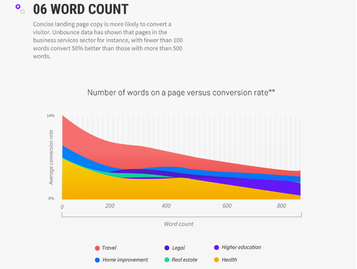
Two particular areas of focus here: the page headline and call to action.
To stay on theme, the headline should be straightforward and catchy without falling prey to wordiness. As it will likely be the most prominent text on your page, you want it to be both intriguing and inviting – much like the most juicy, scroll-stopping Twitter headlines.
Once your headline gets site visitors through your door, a good CTA will ensure they stay for the party. To maximize your CTA, you’ll need some top-notch design and articulate copy.
3. Design + Copy
We’ve already beat the dead horse of brevity and minimalism, but it’s worth mentioning the benefit of professional visuals and wording that resonate with both your users and your underlying message.
At the nucleus of this message is your landing page Holy Grail: the CTA. And given its importance, there are a number of considerations to make your call to action more enticing:
- Color: Will red rebuff users like a stop sign? Will a white button fade to the background? You want the CTA to pop while welcoming further action.
- Size: How big is overwhelming? How small is unnoticeable?
- Location: A key point is that your CTA should be above the fold of your page, to be seen without any scrolling.
- Clarity: Pressing this button should have an obvious outcome (read: benefit!).
- Honesty: Don’t pull a bait-and-switch; be up front with what you’re offering.
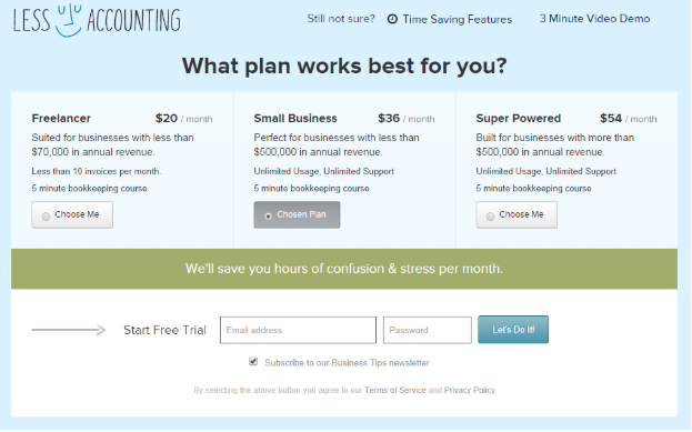
- Message: There’s a huge difference between “Submit” and “Try now!” Take a look at Less Accounting’s subtly friendly approach:
4. Consistency
A well designed landing page is great, but it comes across as a curveball if it looks wildly different from your other media.
Hence the value of consistent branding.
A landing page’s appearance should be in line with the rest of your site, as well as the entry points to get there. This includes your marketing emails, social media accounts, and pay-per-click streams.
Consistent branding actually cuts down your work; you can easily reuse and recycle the same logos, graphics, slogans, and catchy copy over and over. The real trick is to make sure you haven’t glossed over any entry points, particularly if you undergo a rebrand.
Brand congruence is the difference in appearance between a used car dealership and a Tesla center. In other words, it’s a necessity for establishing trust and reputability.
5. Legitimacy
You want to widen the line between your product and scams as much as possible.
Beyond sleek design and brand consistency, this means not spamming your CTA all over the place and inserting appropriate marks of legitimacy.
To steal from our own website, this legitimacy can take a number of forms:
- Factual Data

- Affiliated brand logos

- Prominent user endorsements
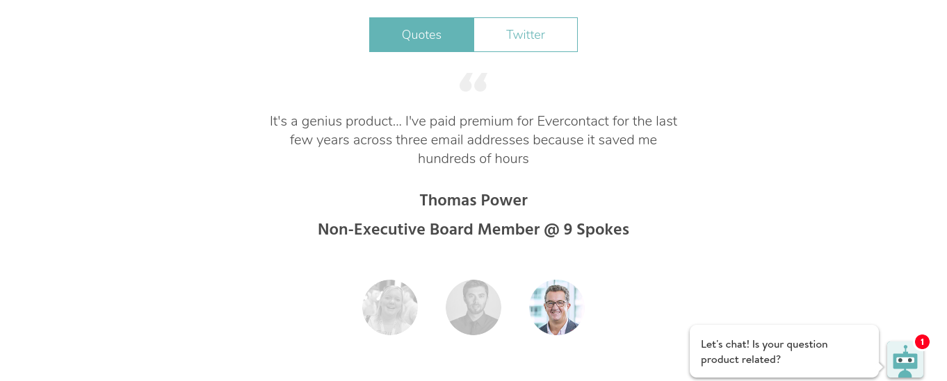
Build your credibility with these tools, but don’t ever exaggerate or give misinformation; let your product stand on its own merit.
Furthermore, your legitimacy is only bolstered by being accessible: make your contact info visible and easy to find. A phone number, support email, and HQ address go a long way in emphasizing there are real humans behind the scenes.
And – showing you care about user safety.
6. Building Trust
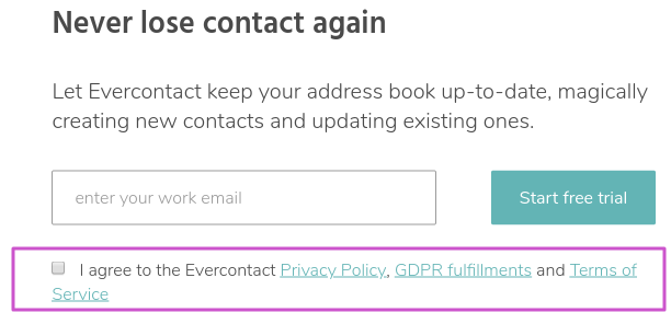
Especially in this day and age, establishing your security measures and GDPR compliance has to be your highest priority. And your sales landing page should reflect that.
People are as careful as ever with where they dole their trust out, so make things simple – both in explaining how you protect them and conveying your own trustworthiness. Provide relevant links to your privacy page(s) and keep the language digestible.
Check out our own approach here:
7. Mobile-Friendliness
It should come as no surprise that people are more inclined to pull the trigger on their mobile devices; after all, this is 2018.
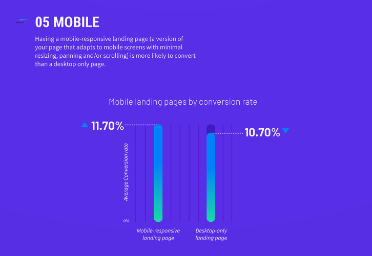
Plain and simple: Ensure your landing page is accessible on phones and other devices. All it does is allow for a wider audience.
8. Cater to your users
Following that thought, not all users are the same; perhaps your landing pages shouldn’t be the same either.
Segmentation is a relatively complex option, but can pay tremendous dividends by appealing directly to certain types of users. This can mean having different sales landing pages for users in certain geographic areas, or for users with different product interests.
And regardless of how you convert them, all users appreciate a heartfelt thank you. Reciprocating a purchase with valuable content, further resources, or even a simple affirmation can do wonders for winning some customer loyalty.
Final word: Strive for more
In all likelihood, your landing page already contains most of these details and features. And if you’ve been around awhile, it’s easy to shrug off your landing page as “good enough.”
Thing is – if you can deep dive and find a way to squeeze even more efficiency out of your landing page, why not take it? A tiny improvement to your sales landing page becomes a tiny improvement to every single marketing endeavor or sales pitch you make.
And we both know: over time, it all adds up.
For more insight on how to optimize your landing page and get the most out of the heart of your website, check out the links below.
Citations and helpful links: